The image above is a film review of Marvel's classic superhero movie 'Spider-Man 2'. The film review is structured as a full, double-paged review that would feature in film and TV magazines.
One of the main components of this film review is the very large, focused image of Spider-Man which takes up the whole 2nd page and some of the first. This is used as a tool to introduce the main character of the film, being Spider-Man, and so that the audience feel more connected to the film the review is detailing as there is actual evidence and physicality of the film being discussed. The image is also carefully chosen, due to the fact that the image has Spider-Man's bright red and blue costume, so that the image stands out on the film review and instantly grabs the audience's attention.
The main bodies of text are all on the first page, and take up the majority of the page. Most of this body of texts is discussing and reviewing the film, in which most readers/audiences will divert their attention to, so they can make best use of the film review itself. The text is discussing the film, what is good about it and what isn't so good, what the film did well, what special moments will grab your attention the most etc. These are all certain features that the audiences will be particularly interested in. There is also a feature part that is discussing Sam Raimi's superb direction which have two paragraphs specially dedicated to it.
Additionally, the brand of film magazine is located in the top left hand page which is in a large, coloured typography and background so that the audience are aware of what they're reading and so that it stands out. It is also filled with a light blue colour so that it is sure to stand out on the 2 pages. Directly underneath this is the title of the film that is being reviewed, it is also in a large black font that stands out from the rest of the review.
There is also additional information regarding the film below this, such as the director, the cast, the plot for the film, distributor, run time etc.
2:
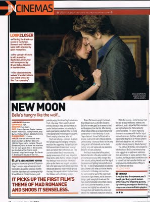
The image above is a film review for the Twilight film, New Moon. This review differs from the Spider-Man 2 review for several reasons, however it is still a fully conventional film review. This film review only takes up one page, with most of the text being on the bottom half of the page.
The primary image for the film is at the top of the review, which is a large landscape still of the main 2 characters from the film series. This image is used as a device to introduce the main 2 characters from the films in action, and can also make the readers more interested in the review as there is physicality from the film itself in the film review.
Below the landscape image from the film is the film's title, 'New Moon', in a large black font to help stand out from the rest of the review. Below it is a tag line for the film review, reading 'Bella's hungry like the wolf...'. This is used as a text based device to help add entertainment and enthusiasm to the film review, which aims to keep the readers interested and also gaining their attention so that they'll carry on and read the whole review.
In addition, below the title and tag line is additional information about the film. This information includes the cast of the film, the director, the distributing studio, production information, the run time etc. This is also information that the readers and viewers will be interested in when it comes to the film.
For this film review, the main bodies of text are roughly the same as the Spider-Man 2 film review in their content and structure. Both bodies of texts are discussing and detailing the films strengths, weaknesses, memorable moments, the direction etc. This is the parts of the text that the readers will be most interested in as it is essentially the reason why they have started viewing the film review in the first place.
Lastly, in the bottom left there is a special text that is comical and is also adding to the entertainment factor of the film review. The text is also in a large red font so it attracts the viewers attention to ensure they'll read it.
3:
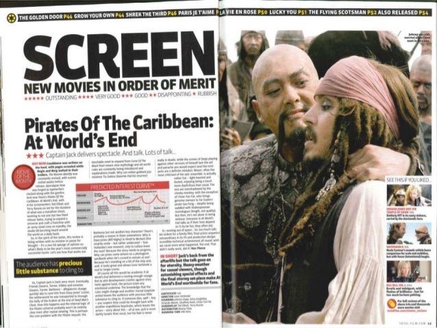
The above image is a film review for Pirates of The Caribbean: At World's End, a Disney box office giant. This film review is a conventional, double paged format film review that can be found in film and TV magazines such as in this instance, Screen.
The right hand side of the film review is dominated by a still of 2 main characters from the film. The image seems to be the 2 characters conversing in such a way that it adds interest and foundation to the image; the readers can see this image and instantly have an understanding of what is going on. The large image is also used as a tool to draw in audiences due to the fact that it is very large and stands out well.
At the top of the film review is a small banner, that has a list of different film or TV reviews and the designated page number they can be found on. This is used as another tool that can help keep readers interested due to the fact there is other film reviews to be read in the magazine.
In the top left of the film review is the magazine's name Screen, in a very large black font that ensures the reader will know what brand of film magazine they are reading, Below this is several official ratings for the film, with the amount of stars they think it deserves as well some words that sum up the amount of stars given. This is used as an informative tool for the readers, so that they know what the amount of stars equates to in terms of the films quality, which can then help decide the readers if they want to see the film or not.
The main reviews for the film are also on the first page and have been formatted in a way that several other images and titles have been composited in the main bodies of text. Such as, there is a chart that is titled 'Predicted Interest Curve'. This can be a tool used to help readers engage with the product, in the way that it is a visual aid of telling the readers how interesting and exciting this film is said to be.
4:
This is a simpler example of film review that has the standard basic conventions and codes.
It has a still from the movie on the right, which takes up a large part of the right hand side of the film review. This is so that the image is nice and large and attracts the audience to the review. The content of the image is also interesting as the female character looks suspicious of something, or weary. This can make the film review more interesting as the image makes the readers more interested or invested in the film. In other words, the selection of image for the film review is considerably important.
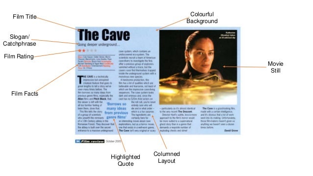
The title for the film review 'The Cave' is in large letters, with a bold font to gain the readers attention.
Below this is a film rating which consists of stars, which is primarily used to establish to the audience the overall verdict of the film. Below this, is the information about the film the audience may want to know, such as the cast, director, certificate, studio of distribution etc.
The text for the film review makes up for a large part of it, and is the main thing audiences will be looking for. There are various different paragraphs detailing the film's strengths and weaknesses, which the reader will read and then form their overall opinion based on these reviews. This is why the review itself is vital to be fair and balanced, because many consumers will take the reviews very seriously and form their opinion based on these reviews.
5:

This is an example of a film review that has not been analysed by myself, and it has been annotated by someone else and I found it on the internet.
However it is another prime example of a classic film review with the most conventional layout.
- Large picture towards the right hand side of the review
- Main bodies of text surrounding the picture, and take up most of the review
- Film title in big bold letters at the top left hand side of the review
- Tag line underneath the film title
- Cast, certificate, director, and overall film information underneath the tag line
6:
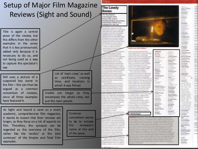
This is another example of a film review that has not been analysed by myself, and it has been annotated by someone else and I found it on the internet.
The film review is on the right of the large image, on the left is all the annotations done by the user. This film review however is less engaging in my opinion, since there is a very large amount of text in this review, with minimal formatting and colour.
However, it still has most of the typical film review conventions. Such as the image from the film at the top of the review, the film title on the top left, main crew and film information under the title, and the review for the film itself underneath all of this in columns.
The annotation on the film title is also something to note, saying the title is 'necessary to do so, and not being used as a way to capture the spectator's eye.' This is something that's different from the other film reviews I've researched, most of these use the title as a common tool to attract and lure the audience in.
7:

This is another example of a film review that has not been analysed by myself, and it has been annotated by someone else and I found it on the internet.
This example however is a physical picture, of a film review in what looks like a magazine. It is once again a very conventional film review with the typical layout for a double page film review. The image and film title are both very large which really draw in the audience to the film review.
There is also a 'Predicted Interest Curve' diagram in the bottom left of the review. This can be used as a tool to entertain the reader by providing them with a diagram to look at. This is a less common convention in films reviews but still definitely fits in with film reviews.
This is another example of a film review that has not been analysed by myself, and it has been annotated by someone else and I found it on the internet.
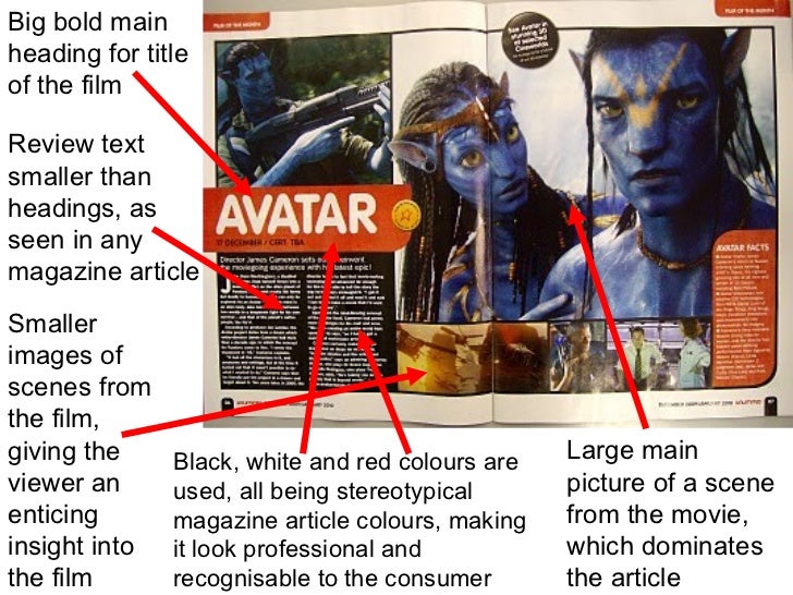
This film review is still conventional, but incorporates more pictures rather than text. This could be used to show off the film, being 'Avatar', and all its visual dazzle, in attempt of getting more people interested in the film. The review is a lot smaller than other film reviews I've researched, but this could be due to the nature of this review specifically and had less reason for a long review. The additional pictures could be making up for it.
There is also a section on the far right called 'Avatar facts', which is another tool of attracting people to the film and all its spectacle.
9:

This is another example of a film review that has not been analysed by myself, and it has been annotated by someone else and I found it on the internet.
This film review features 4 more film reviews on the right hand side, in addition to the primary review of Paranormal Activity 2 on the whole left hand side. The main review on the left is is a conventional film review, which looks very professional and belongs to a film magazine by the looks of it. It has a box of cast and film information underneath the film title and tag line, columns of text, a large picture at the top of the page from the film, and a small verdict at the bottom of the page used to sum up the review.
10:

This is another example of a film review that has not been analysed by myself, and it has been annotated by someone else and I found it on the internet.
This film review is a more compact film review, which seems to be 3 film reviews all on one page. but it still has a mostly conventional structure and layout. It has columns of text for the film review, headlines, pictures and graphics and logos.
-----------------------------------------------
Overall, I am happy with my preliminary research into film reviews. I have learned a considerable amount into the structure of film reviews, specifically such things such as picture layouts, text layouts, titles, putting the review into text columns and so on.
I have learned that a key aspect of films reviews is to inform and detail to audiences the characteristics and overall opinion on certain films, whilst doing so in an entertaining, visually exciting/stimulating way. This can be done through the use of large and eye-catching pictures or fancy, integrated texts and fonts. Film reviews should also essentially display the rating of the film through stars, which are often underneath the title of the film.
I have also learned that films reviews should be balanced in nature, and display a fair, reasonable argument and analysis of the film that includes both the films advantages and disadvantages, when appropriate. This is done so using the columns of text on film reviews where audiences are expected to find the review for the film in itself.
I have also learned about the format of films reviews, and that they can either be set across 2 sides of A4, or they can be vertical instead. Both are perfectly valid formats of film review and are standard conventions also.
With this research and information now complete, I now feel confident to begin starting my drafts of film review and this will be underway in the near future.